
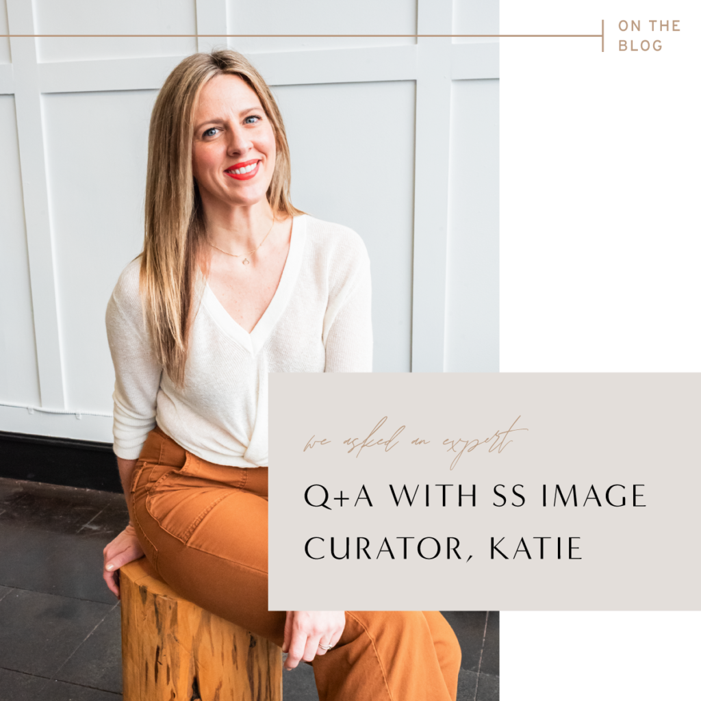
Q+A with SS Image Curator, Katie
We sat down with our very own Image Curator, Katie Brooks to ask her your burning questions on how to curate images for a polished grid. For most of us, our Instagram grid serves as a handshake to our business. It’s that first introduction to our brand so we tend to spend a lot of time trying to make it just right. Katie is going to help you move past some of the guesswork so you can curate images like a pro!
But first, who is Katie anyway?
Color enthusiast, visual communicator, facilitator of vibes, vintage appreciator. I’m a mom of three rad kids, partner to a life-loving husband and we all live in Minnesota in a super old house.
Professionally I’m a ‘jane-of-all-trades-creative’ specializing in elevating the visuals of women-led small businesses. Prior to product development and image curation at Social Squares, I gained industry experience in roles as art director, trend editor and fashion stylist, wedding blog editorial director, social media curator and content creator, luxury invitation designer, wedding designer (full disclosure this was for one wedding that was subsequently published in the Style Me Pretty book-yay!- but then swiftly concluded this was NOT the career for me. lol)
Questions for Katie:
1. When we’re thinking about curating our grid, what’s the first thing to consider?
What do you want your audience to feel when they visit your profile— ‘joyful’ ‘healthy’ ‘calming’ ‘vibrant’ ‘edgy’? Keep your specific brand characteristics in mind as you select imagery. It helps you stay in your lane and narrow down choices. I’m all about streamlining content creation! Establishing a few rules for yourself will help you make quick decisions and also help your feed maintain a consistent visual vibe. For instance—you’re a Virtual Assistant with an ‘edgy’ vibe and you lean towards moody imagery in a dark, neutral palette. You’re attracted to a multi-color bouquet on a teal vintage car—beautiful, but doesn’t fit your brand vibe— skip it and find an image of a singular white flower in a vase on a neutral background.
Design Pro tip: Constraints are a designer’s best friend. Act like a designer and define your vibe and stick to it.
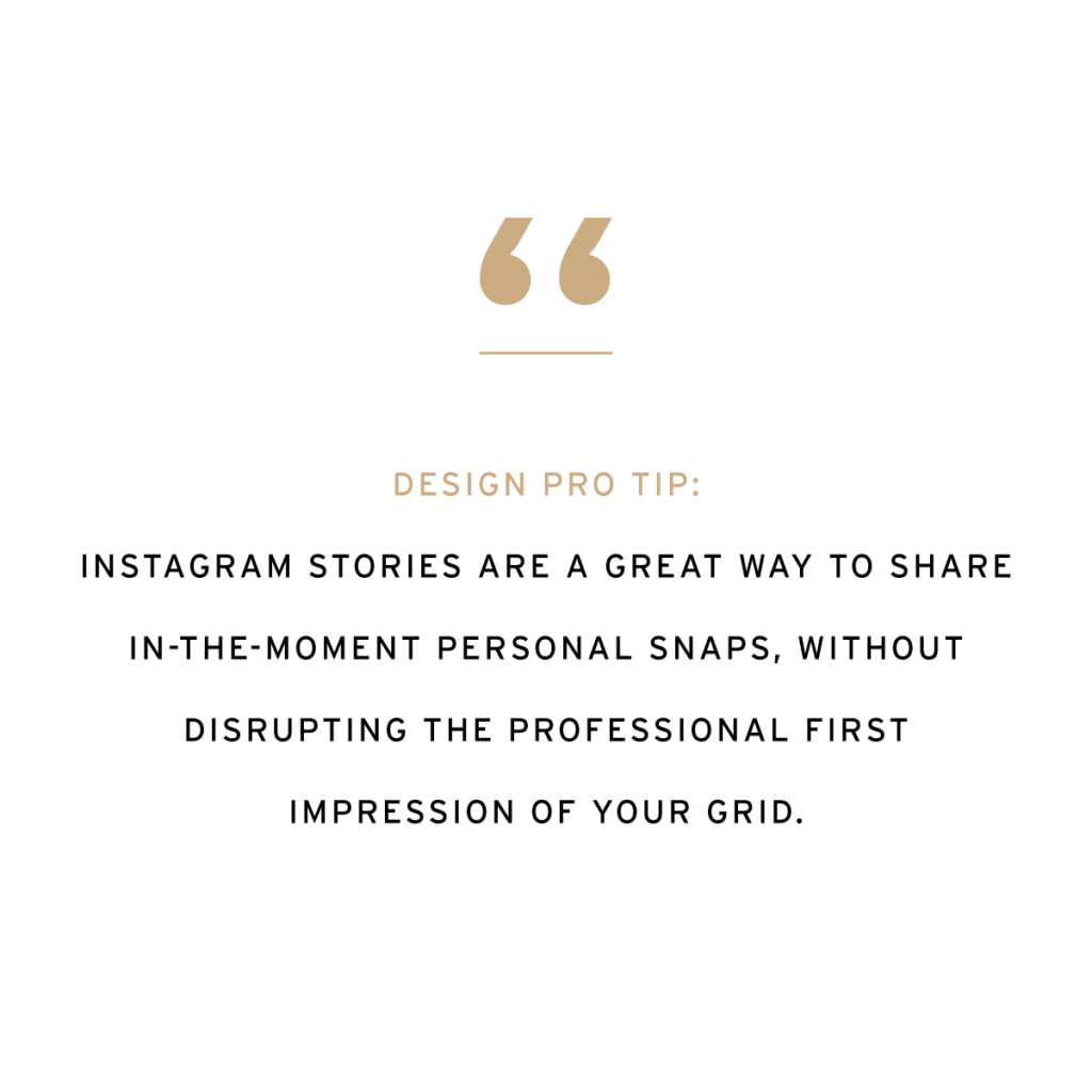
2. I’m nervous about using stock and my grid not feeling authentic, what’s the best way for me to incorporate stock with my own images?
First we always recommend you invest in a professional brand shoot, buuuut totally recognize that you might be building toward this. In the meantime professional imagery elevates your brand—lean on it with SS images and sprinkle in your own (great lighting is a must) by utilizing an SS polaroid mock up and inserting a family snapshot or posting a carousel of some recent personal snaps with an on-brand SS image as the first slide. Also—love reels and videos of the authentic human behind the brand—apply an SS image cover to stay on-brand.
Design Pro Tip: Instagram Stories are a great way to share in-the-moment personal snaps, without disrupting the professional first impression of your grid.
3. I have a color palette for my brand that I love… how do I incorporate my brand colors on my grid without being so literal?
Lifestyle images! Use desktops and flatlays that incorporate your literal brand colors and then supplement those with travel and lifestyle images that have pops of your brand colors!
4. What are your top tips about image composition… what exactly is it and how do I apply the concept to my grid?
We can talk about composition in two ways here: 1) Image composition—this is how a photographer frames the subject of an image—from tight close-ups to long shots that include more visual detail to a vignette that lives somewhere in between. 2) Grid composition—this is the way you are curating the photos in your grid. We want to see variety! Variety is key to a balanced grid. Alternate between close up and pulled back shots, simple and busy images.
Design Pro tip: Apply the two-thirds rule. If you want a more simplified grid— ⅔ of your posts should be simple images with lots of negative space and ⅓ images with more detail or ‘busier’ images. Or vice versa—post ⅔ more visually detailed images and ⅓ super simple images.
5. Now… how exactly do I curate the right types of images for a polished grid?
Apply answers 1-4 above 😉 Also pre-planning really, really, REALLY helps here. Utilize the SS Custom Curation option within your membership. Consider curating a selection of images that can work as your ‘brand imagery.’ Favorite a collection of desktop and lifestyle images in your brand palette and vibe. Our Instagram Content Bucket Guide is a great resource for selecting the type/subject of images you might need for a topic. It features a great section along the lines of ‘if you are posting about____then use ____ type of image.’ Super helpful starting point!
Design Pro tip: Repetition is your friend. Pull images that are a variation of the same props/scene and use them all. Repeating similar imagery creates a visual continuity that establishes brand identity.
READY FOR MORE TIPS ON HOW TO SELECT THE BEST IMAGES FOR YOUR BRAND? DOWNLOAD OUR FREE GUIDE, HOW TO SELECT THE RIGHT IMAGES FOR YOUR BRAND: SO YOU CAN CHARGE MORE & ATTRACT THE RIGHT CLIENTS BY CLICKING THE BANNER BELOW.


Comments +
Comments —